

Step 1: Log In to Your Dashboard
Visit the Login Page: Open the astrology dashboard login page in your browser.
Enter Your Email and Password:
- Type your registered email ID in the "Email" field.
- Enter your password in the "Password" field. (If you’ve forgotten your password, click the "Forgot Password" link below to reset it.)
Click "Sign In":
- Press the purple "Sign In" button to log in.
New User?
- If you don’t have an account, you can sign up for a 7-day Free Trial.

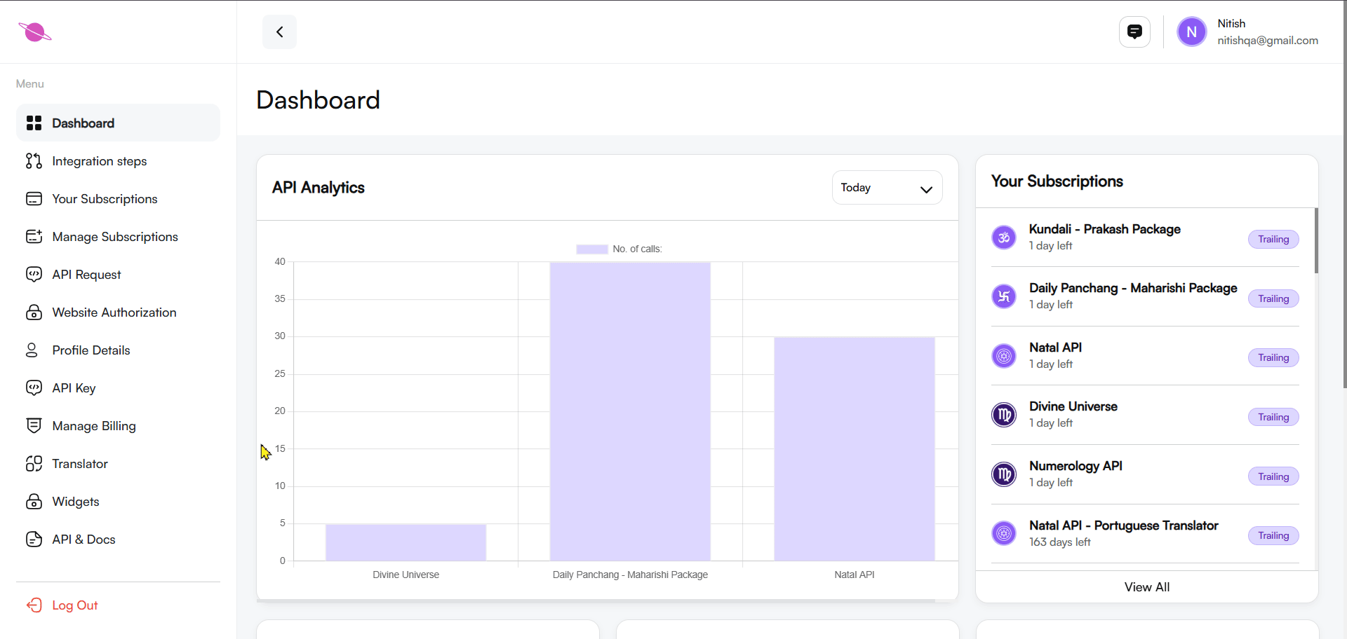
Step 2: Navigate to the Dashboard
After logging in, you will be directed to the main dashboard. Here, you can access multiple features like subscriptions, billing, API keys, and widgets.
- Locate the Widgets option in the left-hand menu.
- Click on it to view and manage your Natal basic widgets.

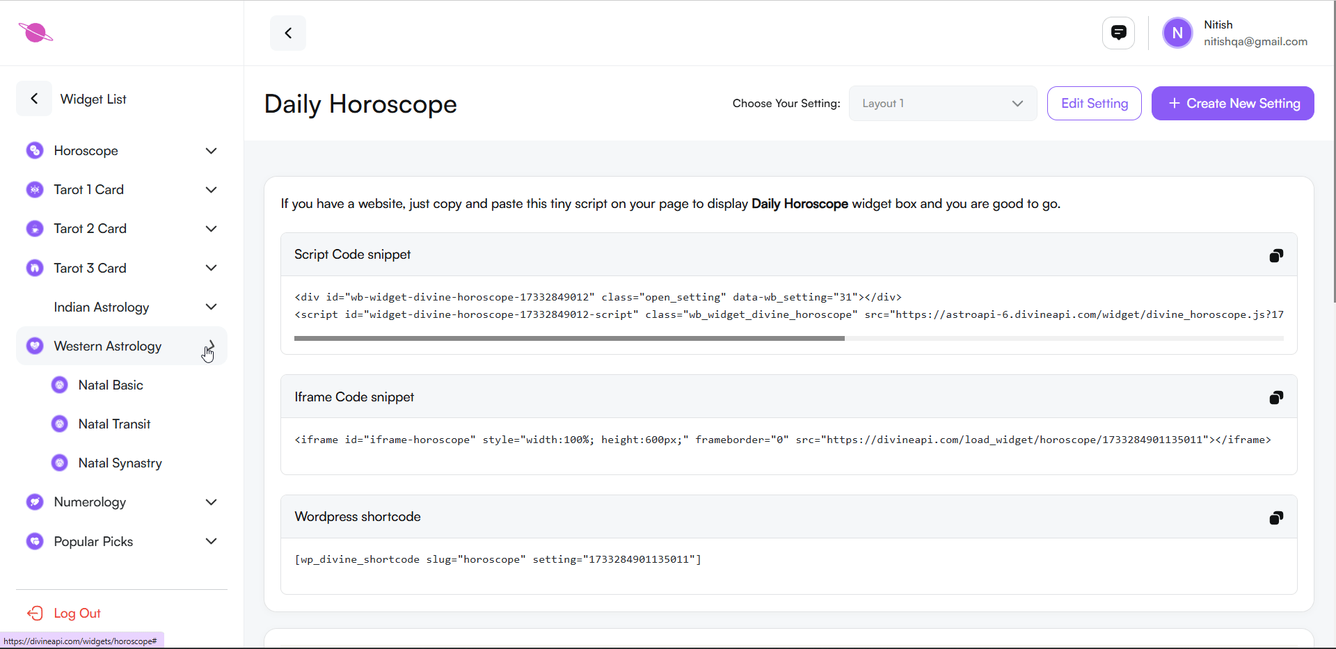
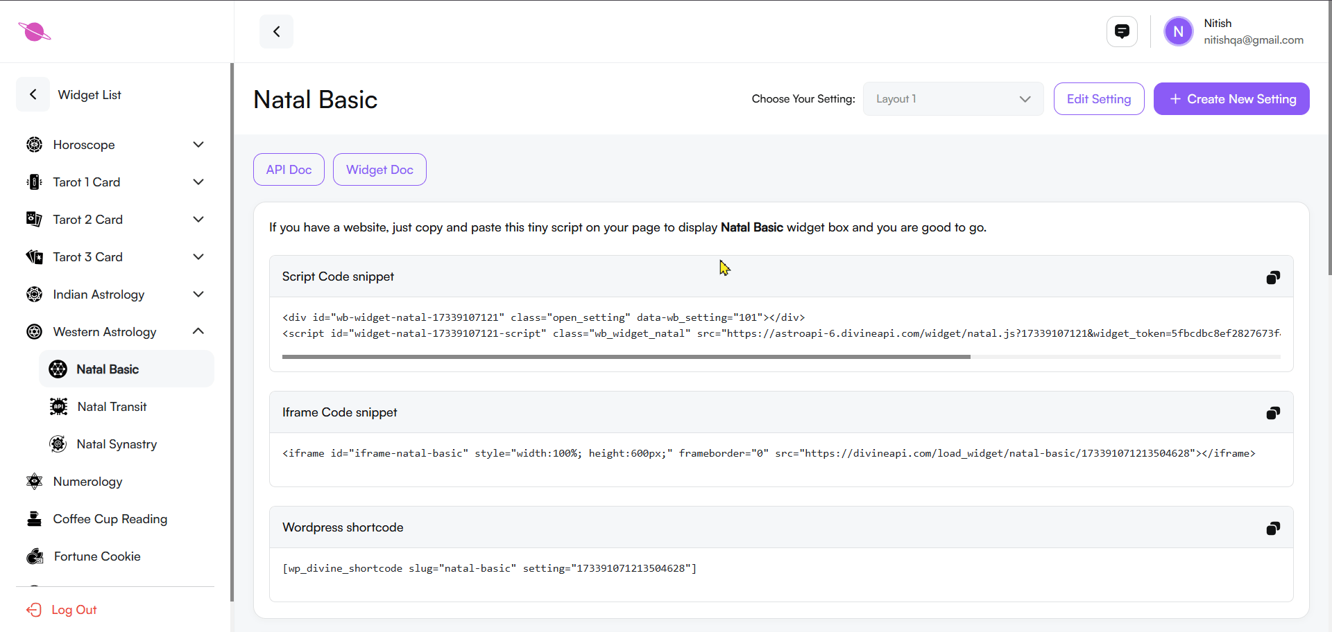
Step 3: Select the Desired Widget
In the widget section, you’ll find a list of available widgets, such as Horoscope, Indian Astrology, and Tarot Widgets. Select Western Astrology to proceed and then choose the Natal Basic option.
Step 4: Access the Widget Customization Panel
Open the Customization Panel:
- After selecting the Natal basic widget, you’ll see the customization panel with options for integration.
Choose the Integration Method:
Depending on your website platform, you can select one of the following integration options:
- Script Code Snippet: Copy and paste this code directly into your website's HTML to embed the widget.
- Iframe Code Snippet: Use this code for embedding the widget with iframe, suitable for most platforms.
- WordPress Shortcode: For WordPress websites, copy this shortcode and paste it into your page or post.
Plugin Installation (For WordPress Users):
- Ensure that the required plugin is installed and activated on your WordPress website for proper integration of the shortcode.
Copy the Code:
- Select the desired option, click the copy icon next to the code, and paste it into the appropriate section of your website.
Save and Preview:
- Once integrated, save your website changes and preview the widget to ensure it appears as intended.
Step 5: Preview Natal Basic Content
Scroll down the page to access the Widget Preview Section, where you can see how the Natal basic widget will appear on your website. This section allows you to:
- Preview Natal basic Features: View detailed astrological charts, including planetary positions, aspects, houses, and moon phases, as they will appear on your site.
- Switch Between Reports: Toggle between different report categories like Natal Chart, Aspects, Moon Phase, Sign Report, House Report, and Transit Report to ensure all features display correctly.
- Dynamic Interaction: Use the search bar or navigation options to explore how users can interact with the widget for an intuitive experience.
The preview helps you ensure that the widget's design and content align with your website's branding and provide a seamless user experience. This step allows you to confirm how users will see and navigate the Natal Chart widget, ensuring everything is visually appealing and functional before going live.
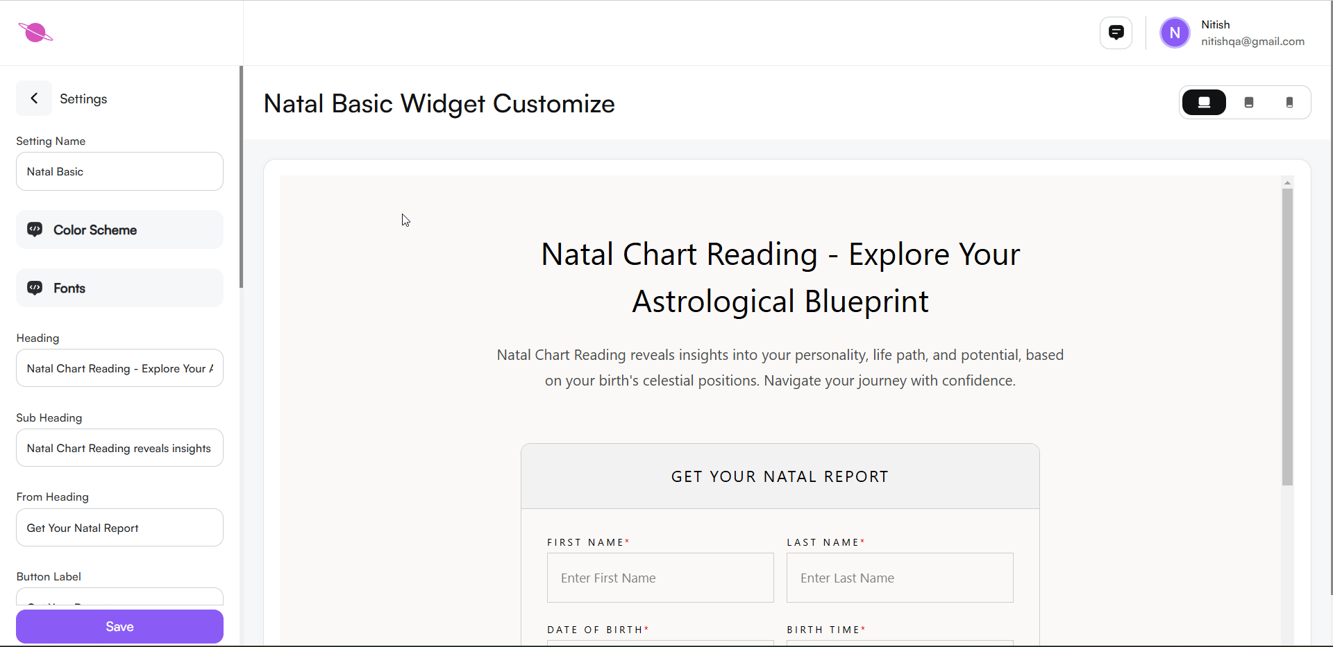
Step 6: Configuring the Widget
Customize the widget's appearance and functionality to align with your page design and user preferences. Follow these steps:
1. Create and Edit a new Setting:
- To set up a new widget configuration, click the “+ Create New Setting” button at the top-right corner of the page.
- You can give your new setting a name (e.g., "Natal basic - Setting 01") to easily identify it later.
- Customize the widget as per your requirements (color schemes, fonts, layout, etc.).
Edit an Existing Setting:
- If you want to modify a previously created widget setting, select the desired setting from the “Choose Your Setting” dropdown menu.
- Click on the “Edit Setting” button to make changes.
- Adjust the customization options and save your changes.

2. Change the Setting Name:
- Locate the Setting Name field in the settings panel.
- Enter your desired name to label this configuration.

3. Adjust the Color Scheme:
Click on the Color Scheme option in the panel.
Select a Pre-set Theme: Choose from various pre-designed color themes, such as:
- Brut: Light, Light Accent, Accent, Dark, Dark Accent.
- Metallic: Subtle metallic tones with lighter and darker shades.
- Evergreen: Calm, green-toned color palettes.
- Burgundy: Modern themes with rich and vibrant shades.
- Serenity: Soft pastel shades including purples and whites.
- Emerald: A deep and rich green palette.
Color Scheme Section: Each pre-designed theme includes options like Light, Light Accent, Accent, Dark, and Dark Accent for fine-tuning colors.
- Customize Colors: Click the Edit (Pencil Icon) to adjust:
- Primary Colors: Background, Heading, Paragraphs, and Lines.
- Secondary Colors: Background, Heading, Paragraphs, and Lines.
Automatic Save: All changes are saved automatically, and you can preview updates in real time in the widget preview section.
4. Adjust the Fonts:
Click on the Fonts option in the settings panel.
A list of font options will appear, including:
- Website Default: Uses the default font style of your website.
- Cormorant Garamond: A classic serif font that provides an elegant and traditional look.
- Forum: A clean, serif font ideal for headings and formal text.
- Sen: A modern sans-serif font for a clean and minimalistic design.
- Montserrat: A popular sans-serif font with a bold and modern appeal.
- DM Sans: A simple and readable sans-serif font, great for body text.
Note: These are some of the best fonts, but more options are available in the Font Section for further customization.
Preview Fonts: Selecting a font will update the widget's text in real-time on the preview section.
Choose a font that matches your website’s style and enhances readability.
Save: Changes are saved automatically without needing manual action.
5.Widget Settings Configuration
Customize the widget's heading and subheading to align with your website's style and message.
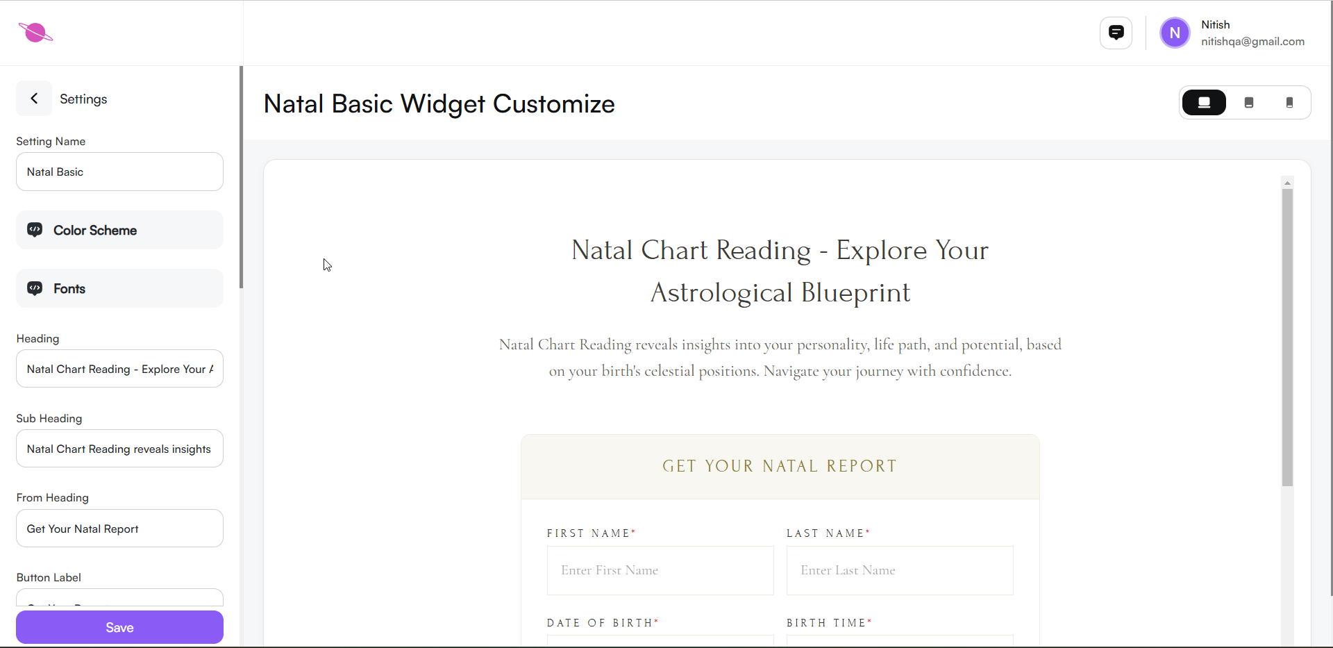
Heading:
- Enter your desired title in the Heading field (e.g., "Natal Chart Reading - Explore Your Astrological Blueprint").
Subheading:
- Add a brief description in the Subheading field (e.g., "Natal Chart Reading reveals insights into your personality, life path, and potential, based on your birth's celestial positions. Navigate your journey with confidence").
Note:
You can personalize these texts to suit your needs. Changes will reflect instantly in the widget preview.

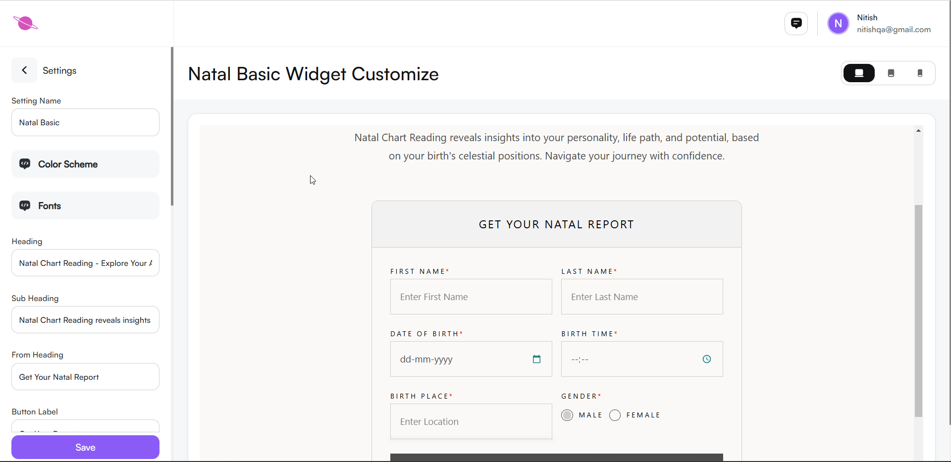
- From Heading: Customize the heading for the input section, like "Get your natal report."
- Button Label: Set a label for the action button, such as "Get Your Report."

- Show Gender Option: In the settings, enable or disable the gender selection feature to allow users to specify their gender, if relevant to the natal Basic report. This can provide more personalized insights for the user.

5.Content Sections Visibility
You can control the visibility of various sections to give users a more tailored experience:
- Personality: Show or hide the personality section to offer insights into the user’s core traits.
- Planet Positions: Display planetary positions to elaborate on the influence of planets at the time of birth.
- House Cusps: Include house cusp information to elaborate on life aspects like career, relationships, and more.
- Aspects: Show aspects to help users understand planetary interactions and their influence.
- Moon Phase: Display the moon phase to provide emotional insights.
- Sign Report: Add sign-related interpretations for each planet to enhance user understanding.
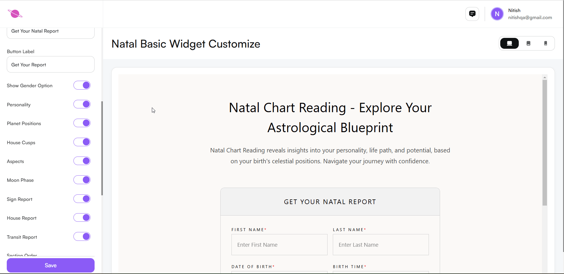
6. Reordering Content Sections
- Customize the order of these sections to suit user needs and improve navigation. For example, placing Personality and Planet Positions at the top can create a smoother user experience by presenting key insights first.

Step 7: Use the Preview Functionality
To ensure your Natal Basic Widget looks perfect across all devices, use the Preview Functionality located in the top-right corner of the customization screen. This feature allows you to switch between different device views:
- Desktop View: See how the widget appears on a large screen.
- Tablet View: Preview how it will display on medium-sized devices like tablets.
- Mobile View: Check the responsiveness and layout on mobile screens.
Toggle between these views to ensure the design, fonts, and content remain consistent across all devices. This step helps you deliver a seamless user experience for all your visitors.
Step 8: Save and Embed the Widget
After finalizing the customization:
- Save the Changes: After making all your customizations, click the Save button at the bottom of the settings panel.
- Return to the Widget Home: Scroll to the top of the page and click the Back button to return to the Panchang home page.
- Preview Updates: Scroll down to see your customized widget on the home page. The updates you made will be visible immediately.
- Use the Code: Copy the generated code snippet to embed the widget on your website.
This process ensures your changes are saved, visible, and ready for integration on your platform.

Conclusion
Following these steps, you can effectively integrate the Natal Basic Widget on your page. This widget enriches the user experience by providing detailed natal chart readings, making astrological insights both accessible and engaging for your audience.