

Step 1: Log In to Your Dashboard
Visit the Login Page: Open the astrology dashboard login page in your browser.
Enter Your Email and Password:
- Type your registered email ID in the "Email" field.
- Enter your password in the "Password" field. (If you’ve forgotten your password, click the "Forgot Password" link below to reset it.)
Click "Sign In":
- Press the purple "Sign In" button to log in.
New User?
- If you don’t have an account, you can sign up for a 14-day Free Trial.

Step 2: Navigate to the Dashboard
After logging in, you will be directed to the main dashboard. Here, you can access multiple features like subscriptions, billing, API keys, and widgets.
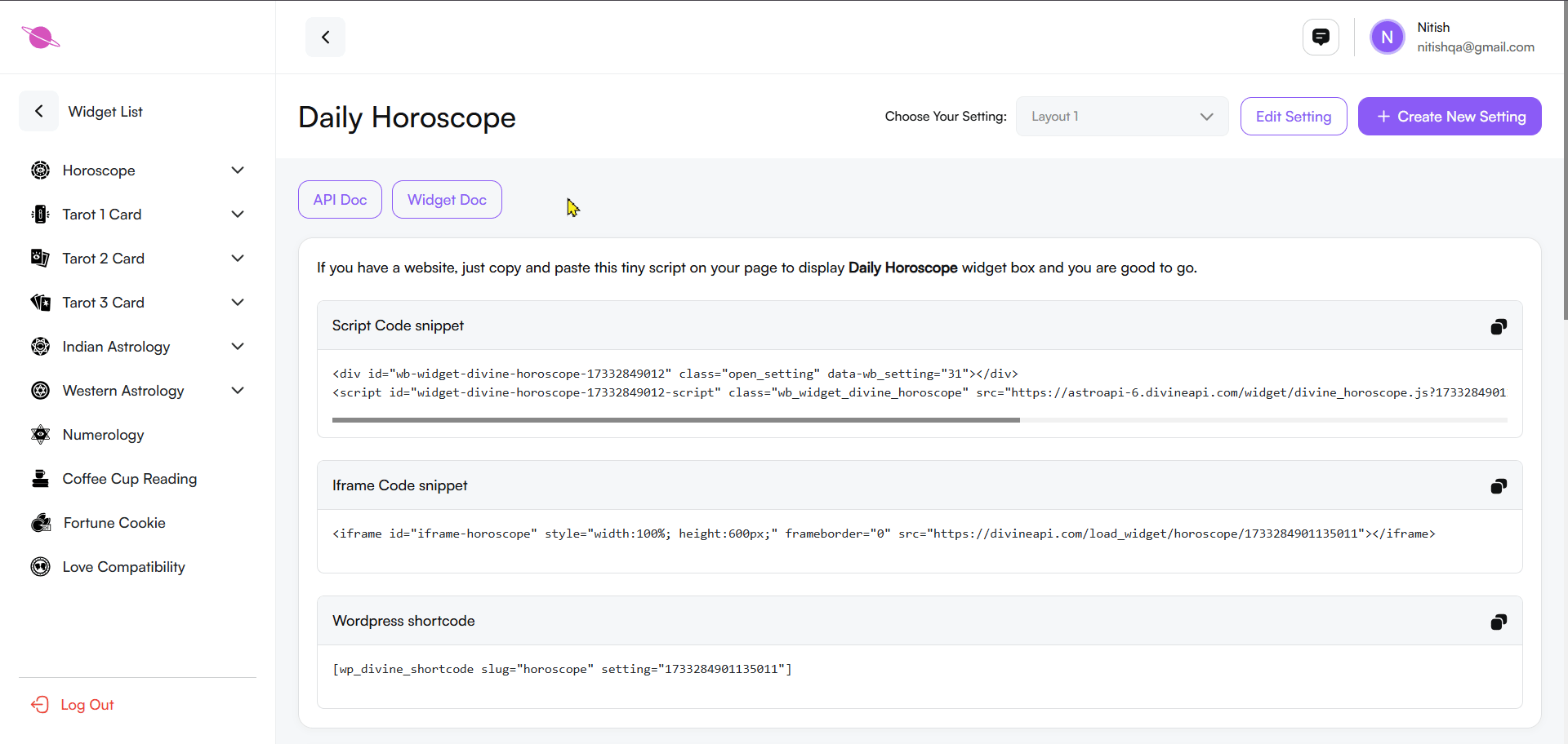
- Locate the Widgets option in the left-hand menu.
- Click on it to view and manage your horoscope widgets.

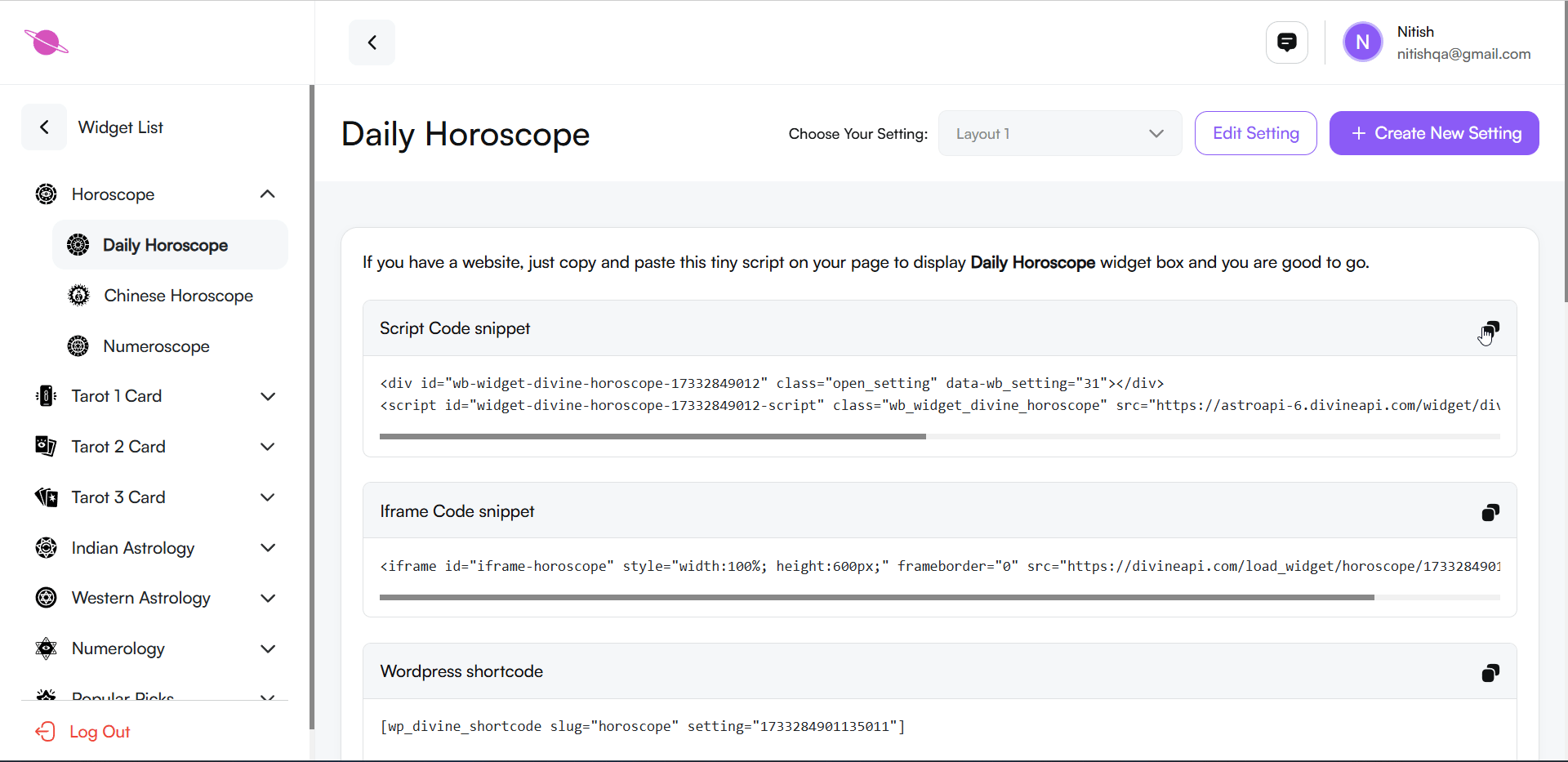
Step 3: Select the Desired Widget
In the widget section, you’ll find a list of available widgets, such as Horoscope, Indian Astrology, and Tarot Widgets. Select Horoscope to proceed, and then choose the Daily Horoscope option.
Step 4: Access the Widget Customization Panel
Open the Customization Panel:
- After selecting the horoscope widget, you’ll see the customization panel with options for integration.
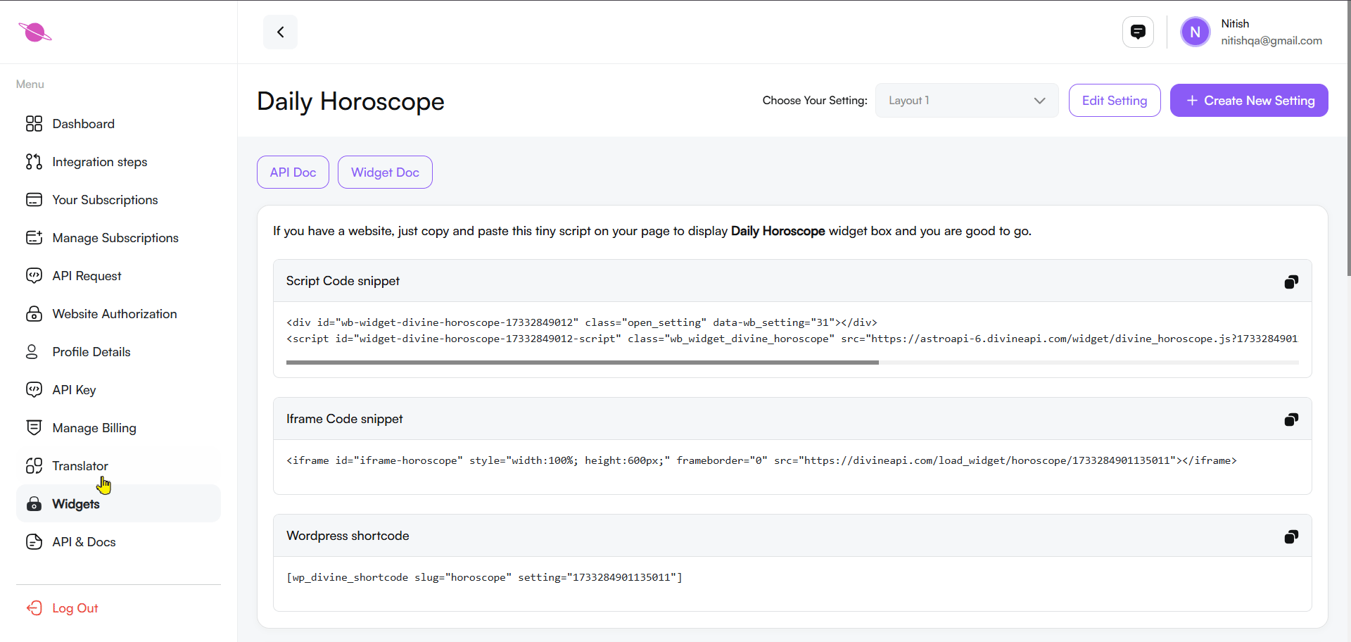
Choose the Integration Method:
Depending on your website platform, you can select one of the following integration options:
- Script Code Snippet: Copy and paste this code directly into your website's HTML to embed the widget.
- Iframe Code Snippet: Use this code for embedding the widget with iframe, suitable for most platforms.
- WordPress Shortcode: For WordPress websites, copy this shortcode and paste it into your page or post.
Plugin Installation (For WordPress Users):
- Ensure that the required plugin is installed and activated on your WordPress website for proper integration of the shortcode.
Copy the Code:
- Select the desired option, click the copy icon next to the code, and paste it into the appropriate section of your website.
Save and Preview:
- Once integrated, save your website changes and preview the widget to ensure it appears as intended.
Step 5: Preview Horoscope Content
Scroll down the page to access the Widget Preview Section, where you can see how the widget will appear on your website. This section allows you to:
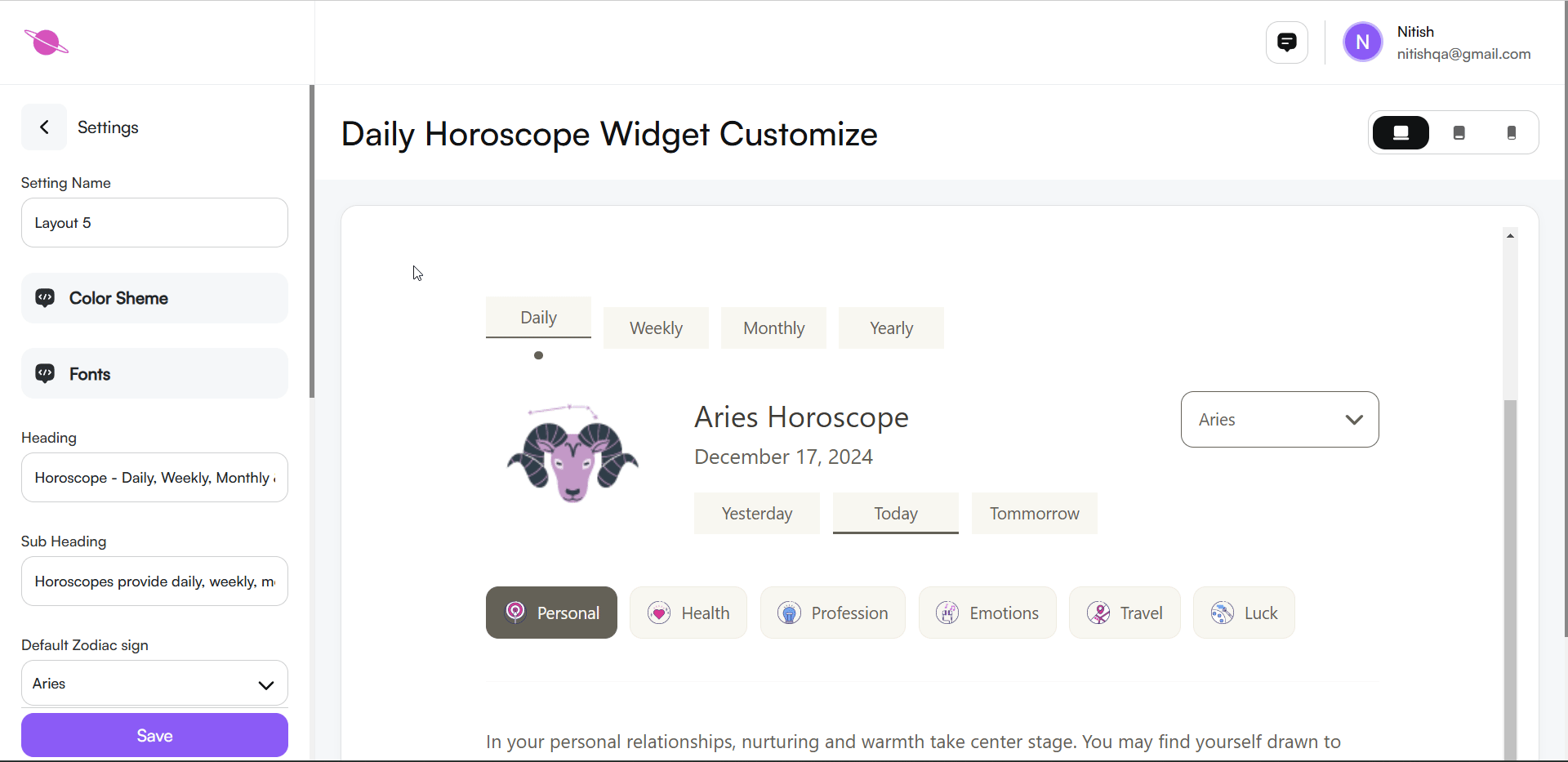
- Preview daily, weekly, monthly, and yearly horoscope predictions.This helps you understand how the widget will look on your website.
- Switch between zodiac signs and various categories like personal, health, profession, emotions, travel, and luck.
The preview helps you ensure the widget looks engaging and aligns with your website's design. It also lets you check how content will be displayed to users.
Step 6: Configuring the Widget
Customize the widget's appearance and functionality to align with your page design and user preferences. Follow these steps:
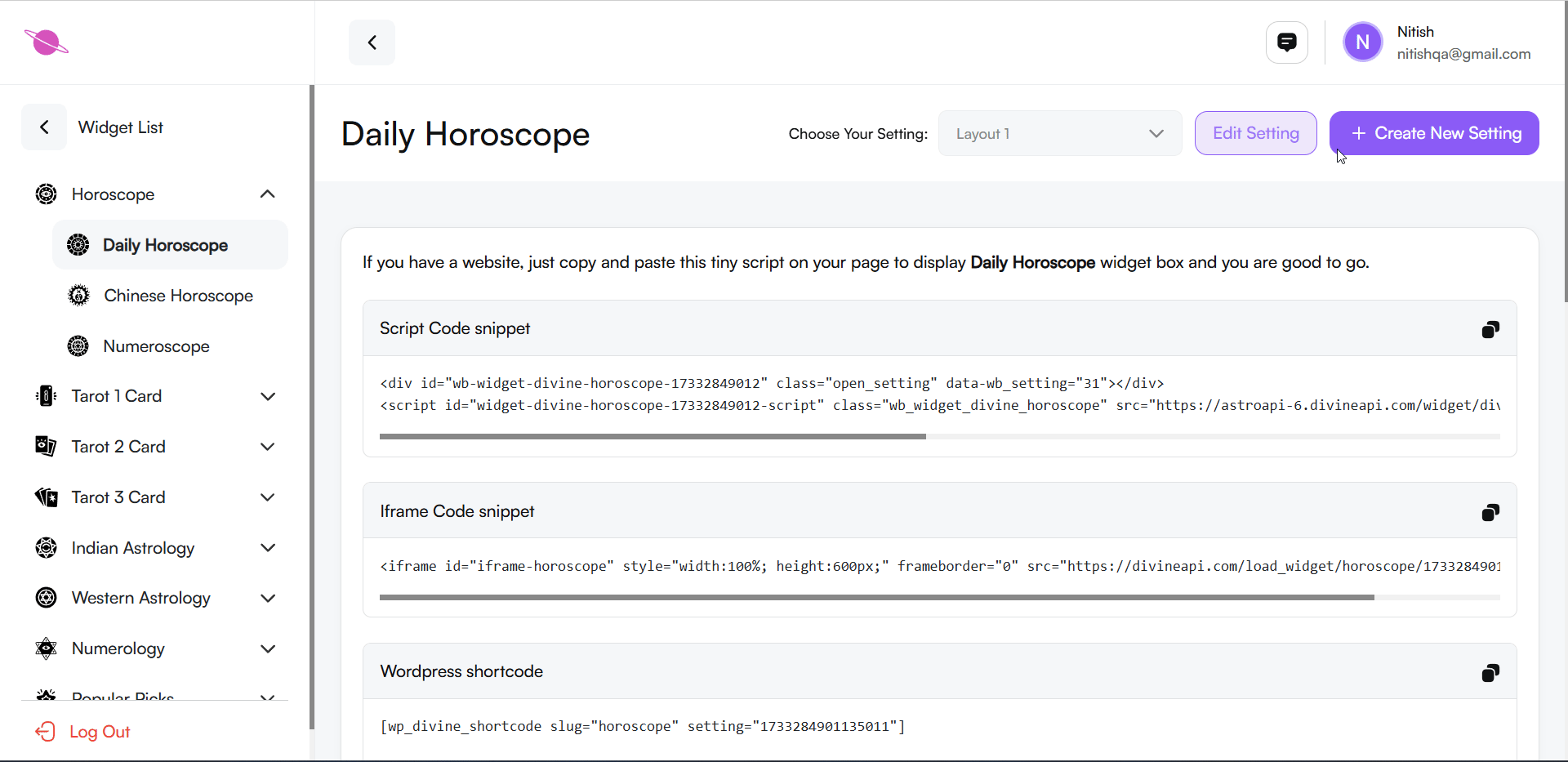
1. Create and Edit a new Setting:
- To set up a new widget configuration, click the “+ Create New Setting” button at the top-right corner of the page.
- You can give your new setting a name (e.g., "Daily Horoscope - Setting 01") to easily identify it later.
- Customize the widget as per your requirements (color schemes, fonts, layout, etc.).
Edit an Existing Setting:
- If you want to modify a previously created widget setting, select the desired setting from the “Choose Your Setting” dropdown menu.
- Click on the “Edit Setting” button to make changes.
- Adjust the customization options and save your changes.
For more information on managing multiple widget settings, refer to this detailed guide.
2. Change the Setting Name:
- Locate the Setting Name field in the settings panel.
- Enter your desired name to label this configuration.

3. Adjust the Color Scheme:
Click on the Color Scheme option in the panel.
Select a Pre-set Theme: Choose from various pre-designed color themes, such as:
- Brut: Light, Light Accent, Accent, Dark, Dark Accent.
- Metallic: Subtle metallic tones with lighter and darker shades.
- Evergreen: Calm, green-toned color palettes.
- Burgundy: Modern themes with rich and vibrant shades.
- Serenity: Soft pastel shades including purples and whites.
- Emerald: A deep and rich green palette.
Color Scheme Section: Each pre-designed theme includes options like Light, Light Accent, Accent, Dark, and Dark Accent for fine-tuning colors.
- Customize Colors: Click the Edit (Pencil Icon) to adjust:
- Primary Colors: Background, Heading, Paragraphs, and Lines.
- Secondary Colors: Background, Heading, Paragraphs, and Lines.
Automatic Save: All changes are saved automatically, and you can preview updates in real time in the widget preview section.
4. Adjust the Fonts:
Click on the Fonts option in the settings panel.
A list of font options will appear, including:
- Website Default: Uses the default font style of your website.
- Cormorant Garamond: A classic serif font that provides an elegant and traditional look.
- Forum: A clean, serif font ideal for headings and formal text.
- Sen: A modern sans-serif font for a clean and minimalistic design.
- Montserrat: A popular sans-serif font with a bold and modern appeal.
- DM Sans: A simple and readable sans-serif font, great for body text.
Note: These are some of the best fonts, but more options are available in the Font Section for further customization.
Preview Fonts: Selecting a font will update the widget's text in real-time on the preview section.
Choose a font that matches your website’s style and enhances readability.
Save: Changes are saved automatically without needing manual action.
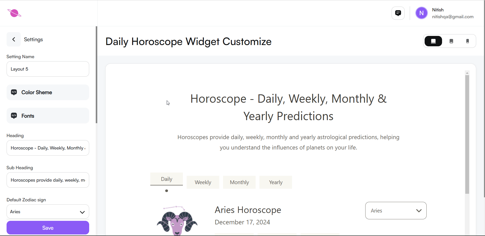
5. Heading and Subheading
Customize the widget's heading and subheading to align with your website's style and message.
Heading:
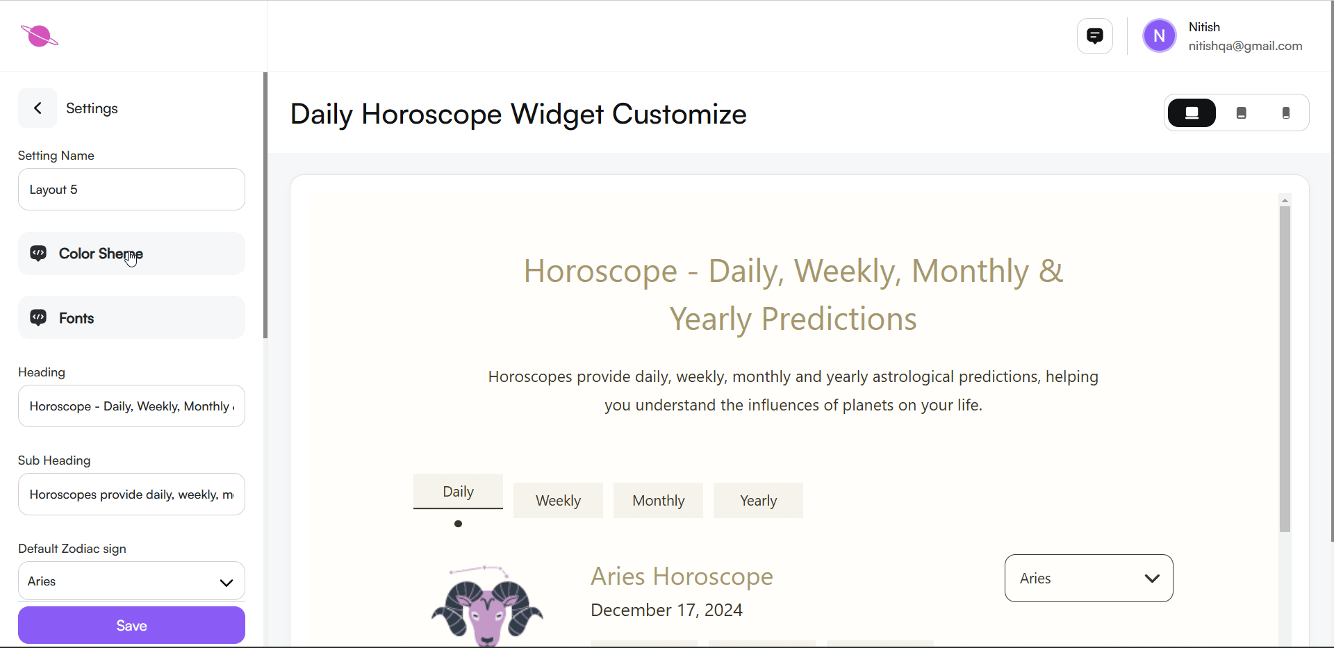
- Enter your desired title in the Heading field (e.g., "Horoscope - Daily, Weekly, Monthly & Yearly Predictions").
Subheading:
- Add a brief description in the Subheading field (e.g., "Horoscopes provide daily, weekly, monthly and yearly astrological predictions, helping you understand the influences of planets on your life.").
Note:
You can personalize these texts to suit your needs. Changes will reflect instantly in the widget preview.

6. Default Zodiac Sign
- Set a default zodiac sign to display when users first view the widget.
- In the settings panel, find the dropdown labeled Default Zodiac Sign.
- Select a zodiac sign (e.g., Aries, Taurus) from the options.

7. Width Settings
- Adjust the widget's width to fit your page layout.
- Options include Small, Medium, and Large.
- Choose the size that complements your page design.
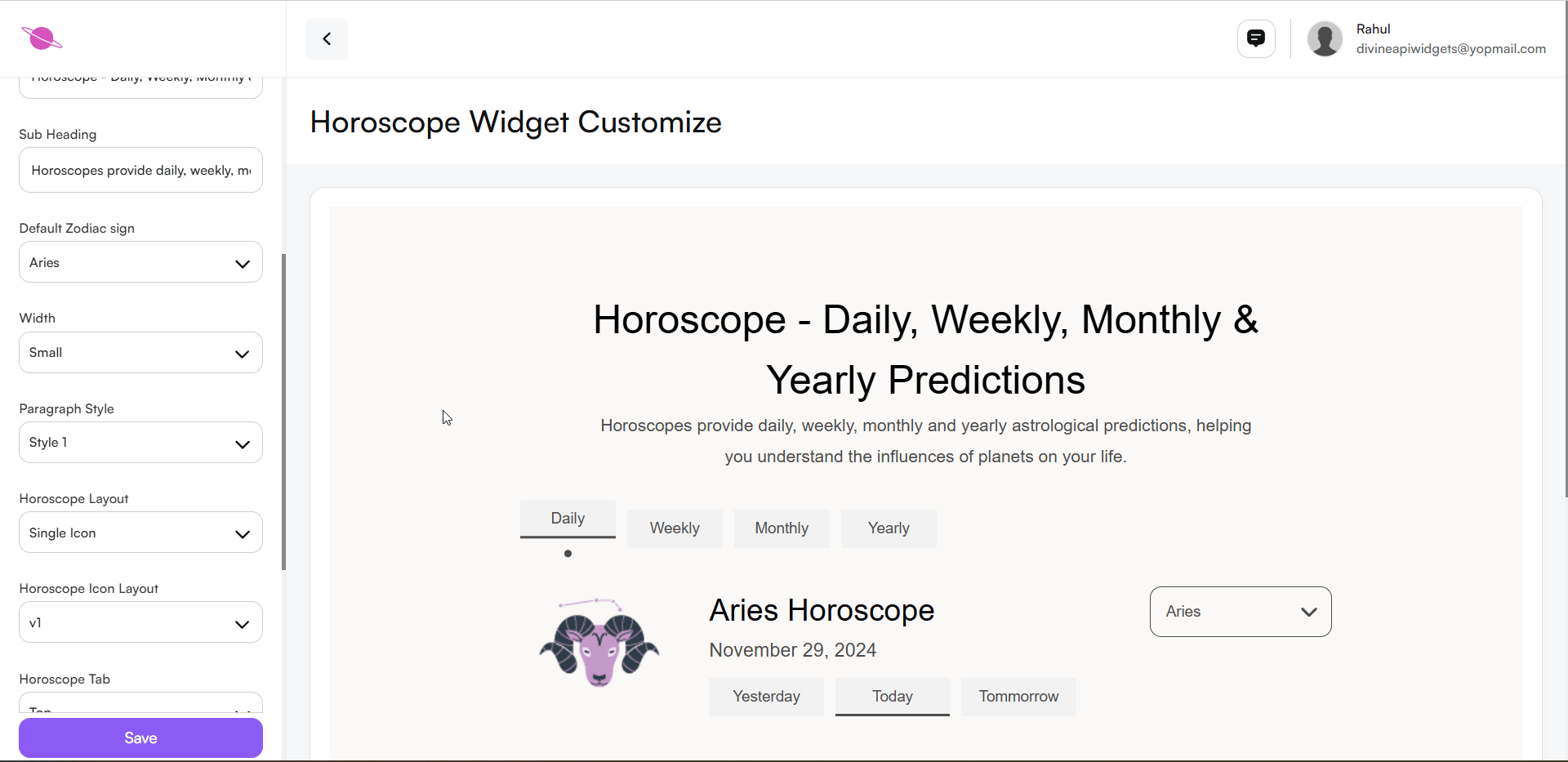
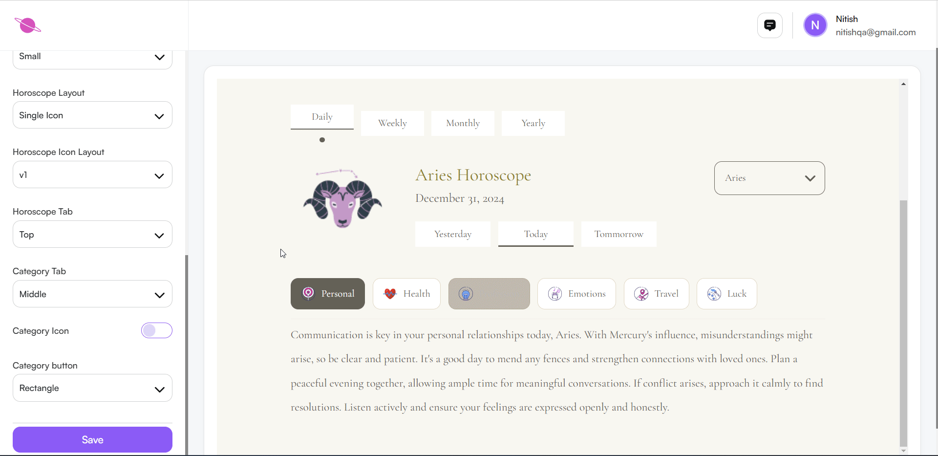
8. Horoscope Layout
This step allows you to define how horoscope icons are displayed on your website. You can choose the layout style that best fits your website's design and user preferences.
Layout options:
- Single Icon: Displays one icon.
- Grid Icon: Shows all icons in a grid format.
- Carousel Icon: Allows users to scroll through icons.
Select the option that suits your page's design and user experience.
Step 7: Additional Customizations for Widget Display
Further refine your widget with these customization options:
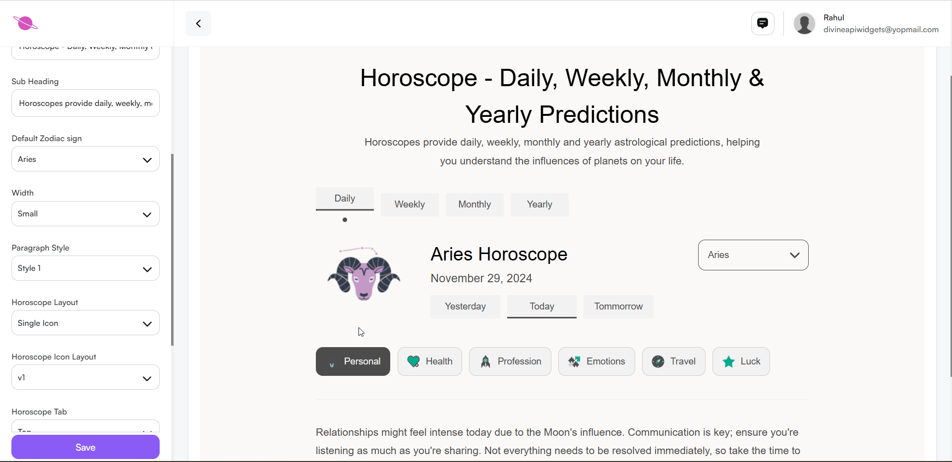
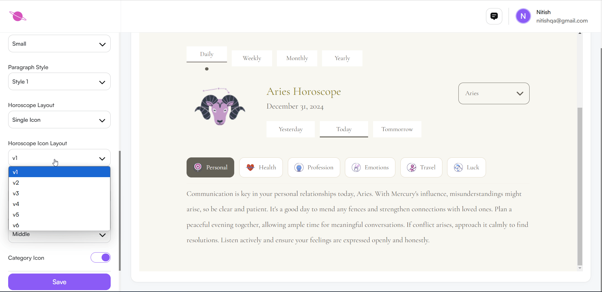
1. Horoscope Icon Style
You can easily update the style of horoscope icons in your widget. Follow these steps:
Choose a Layout:
- Click the dropdown menu under "Horoscope Icon Style" in the settings panel.
- Select your preferred style (e.g., v1, v2, v3, etc.) from the available options.
Preview Changes Automatically:
- As soon as you select a layout, the changes will be automatically applied and visible in the widget preview.
This ensures a seamless customization experience, allowing you to see how the icons will appear in real-time.
2. Daily Weekly Tab Position
Choose Tab Position:
- Click on the dropdown menu to view available positions: Top, Middle, or Bottom.
Select Your Preferred Position:
- Click on the desired position (e.g., "Middle") to place the daily weekly tabs in the corresponding area on the widget.
Automatic Update:
- Once you select the position, the widget layout will update automatically to reflect your changes.
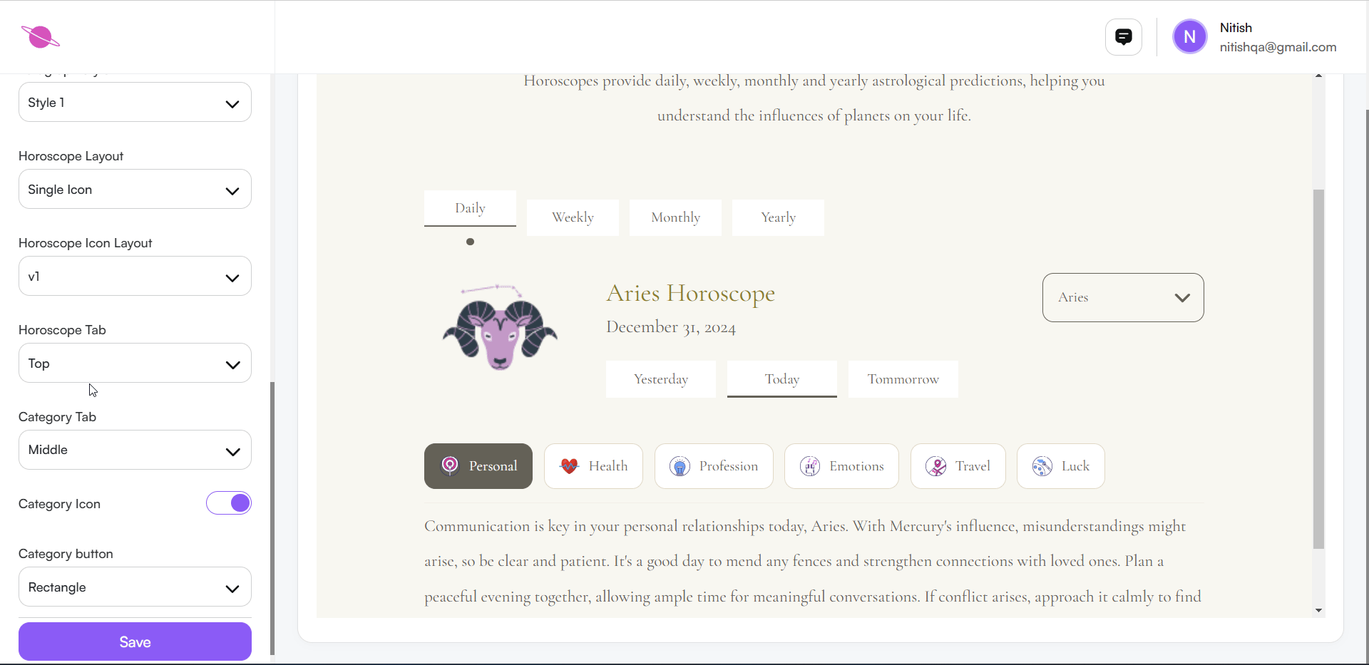
3. Category Tab Position
- Control where category tabs (e.g., Personal, Health, Profession) appear.
- Options: Middle, Bottom, or specified locations.

4. Category Icon
Turn Category Icons On/Off:
- Locate the Category Icon toggle in the customization panel.
- Slide the toggle to the right (purple) to enable icons or to the left (grey) to disable them.
Instant Preview:
- As you toggle, the changes will reflect immediately in the widget preview section.
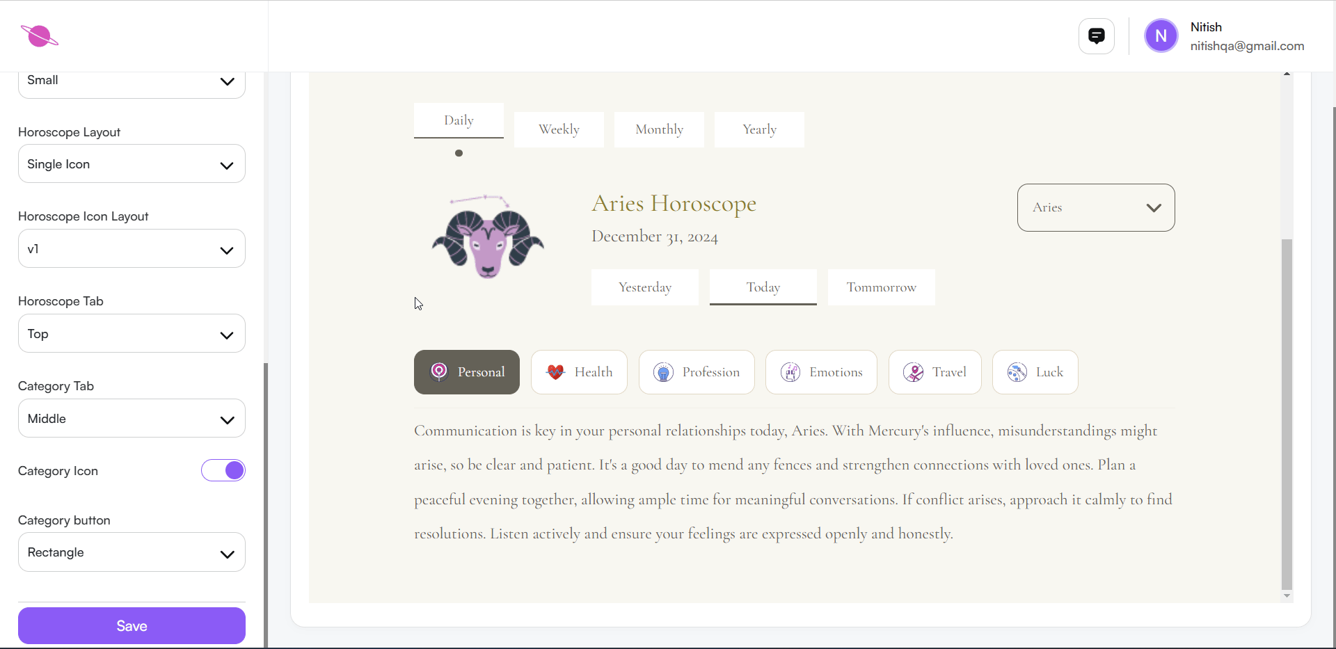
5. Category Button Style
- Adjust the shape of category buttons.
- Options include Rectangle or Square.
- Choose a shape that aligns with your design aesthetic.

Step 8: Use the Preview Functionality
To ensure your horoscope widget looks perfect across all devices, use the Preview Functionality located in the top-right corner of the customization screen. This feature allows you to switch between different device views:
- Desktop View: See how the widget appears on a large screen.
- Tablet View: Preview how it will display on medium-sized devices like tablets.
- Mobile View: Check the responsiveness and layout on mobile screens.
Toggle between these views to ensure the design, fonts, and content remain consistent across all devices. This step helps you deliver a seamless user experience for all your visitors.
Step 9: Save and Embed the Widget
After finalizing the customization:
- Save the Changes: After making all your customizations, click the Save button at the bottom of the settings panel.
- Return to the Widget Home: Scroll to the top of the page and click the Back button to return to the Daily Horoscope home page.
- Preview Updates: Scroll down to see your customized widget on the home page. The updates you made will be visible immediately.
- Use the Code: Copy the generated code snippet to embed the widget on your website.
This process ensures your changes are saved, visible, and ready for integration on your platform.
Conclusion
With these easy-to-follow steps, you can customize and integrate horoscope widgets effortlessly into your platform. Use this feature to engage your users with daily astrological insights and boost user interaction on your website.